
Ideas for better growth
How to Add an Image Slider to Your Website
Chris Content · · 4 min read

Sliders are easy to add and easy to get wrong. When a slider is the right tool, how to configure it accessibly, and what to use instead when it is not.
An image slider is one of the most requested and most misused elements on a website. It looks like a way to fit several messages into one space. In practice it is a way to make sure only the first one is seen.
This guide covers when a slider genuinely helps, how to configure it so it does not hurt, and what to use instead when it does not.
What the evidence generally shows
Across many published tests, the pattern is consistent:
- The first slide gets the overwhelming majority of interaction
- Later slides get a small fraction of it
- Rotating content is often ignored entirely, because it resembles advertising
- Autoplay moves content away while people are reading it
- Each additional slide adds weight and, usually, layout shift
That does not make sliders useless. It makes them a poor container for your most important message.
When a slider is the right tool
Good uses:
- Product image galleries, where the visitor is deliberately browsing one item's photographs
- Sequential content, such as steps in a process
- Testimonial rotation, where each item is short and equivalent
- Space-constrained mobile layouts, where a grid genuinely will not fit
Poor uses:
- Your primary homepage message
- Several unrelated campaigns competing for one slot
- Anything with a call to action you actually need clicked
- Content that must be read to be understood
Configure it properly
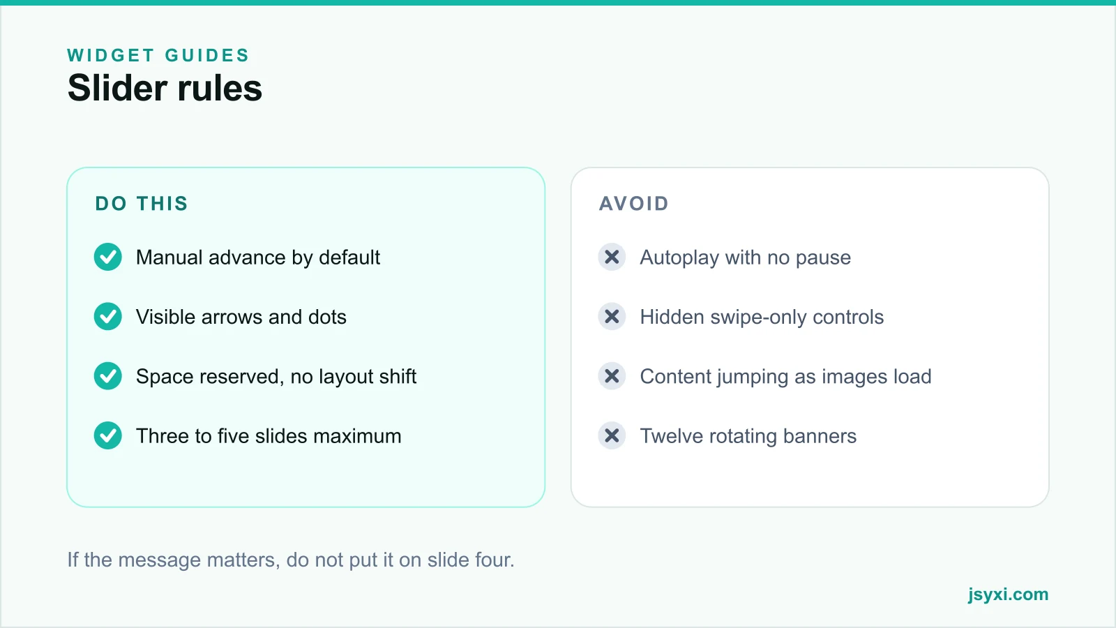
The Image Slider widget covers banners, promotions, and hero content. Whatever you use, apply these rules:
- Do not autoplay by default. If you must, use a slow interval, pause on hover and on focus, and stop permanently after any manual interaction.
- Show controls. Visible arrows and position dots. Swipe-only is invisible on desktop and undiscoverable on mobile.
- Indicate position. "2 of 4" or filled dots, so people know how much is left.
- Limit to three to five slides. More is an archive, not a message.
- Reserve the space. Fix the aspect ratio so nothing shifts as images load.
- Load the first slide eagerly, the rest lazily. Only the first is needed for the first paint.
Make it accessible
Sliders are a frequent accessibility failure:
- Controls must be reachable and operable by keyboard, with a visible focus state
- Slide changes should be announced politely to assistive technology
- Autoplay must be pausable, and must respect the reduced-motion preference
- Text must not be baked into images - it cannot be read, resized, or translated
- Every image needs meaningful alt text
Our accessibility checklist covers the wider requirements.
Protect page speed
A slider is several full-width images. That makes it the most common cause of a slow hero:
- Compress and size every slide for its display size
- Serve modern formats and responsive widths
- Preload only the first slide
- Avoid a slider library that ships more code than your entire page
See our image optimization guide and page speed guide.
What to use instead
If the slider exists because several teams wanted homepage space, the answer is usually not a better slider:
- One strong hero with a single message and one action - see what belongs above the fold
- A static grid of two or three cards, all visible at once
- **A feature grid or category tiles**, so nothing is hidden
- **An announcement bar** for a time-limited promotion, separate from the hero
Three messages visible simultaneously outperform five that take turns.
Common mistakes to avoid
- Autoplay with no pause control. It is an accessibility failure and a reading failure.
- Important calls to action on later slides. They are effectively unpublished.
- Text inside the image file. Unreadable, untranslatable, unresizable.
- No reserved height. The page jumps as each image arrives.
- Twelve slides. Nobody reaches slide five.
Frequently asked questions
Are image sliders bad for conversion?
For a primary homepage message, usually yes - the first slide takes almost all the interaction and rotation is often ignored. For product galleries and sequential content, a slider is appropriate.
Should a slider autoplay?
Prefer manual advance. If you autoplay, use a slow interval, pause on hover and focus, respect reduced-motion preferences, and stop permanently once the visitor takes control.
How many slides should a slider have?
Three to five. Beyond that you are storing content nobody will reach, while adding page weight and layout risk.
Do sliders hurt SEO?
Not directly, but they commonly hurt Core Web Vitals through large images and layout shift, and text baked into slide images is not readable content. Both of those matter.
Next steps
Check whether your homepage slider is carrying a message that needs to be seen. If it is, move that message into a single static hero and keep the Image Slider widget for galleries and sequences.
Start free and configure one properly.