
Ideas for better growth
A Website Accessibility Checklist
Chris Content · · 5 min read

A practical accessibility checklist for small teams: contrast, keyboard access, labels, focus, motion, and the widget behaviours that most often lock people out.
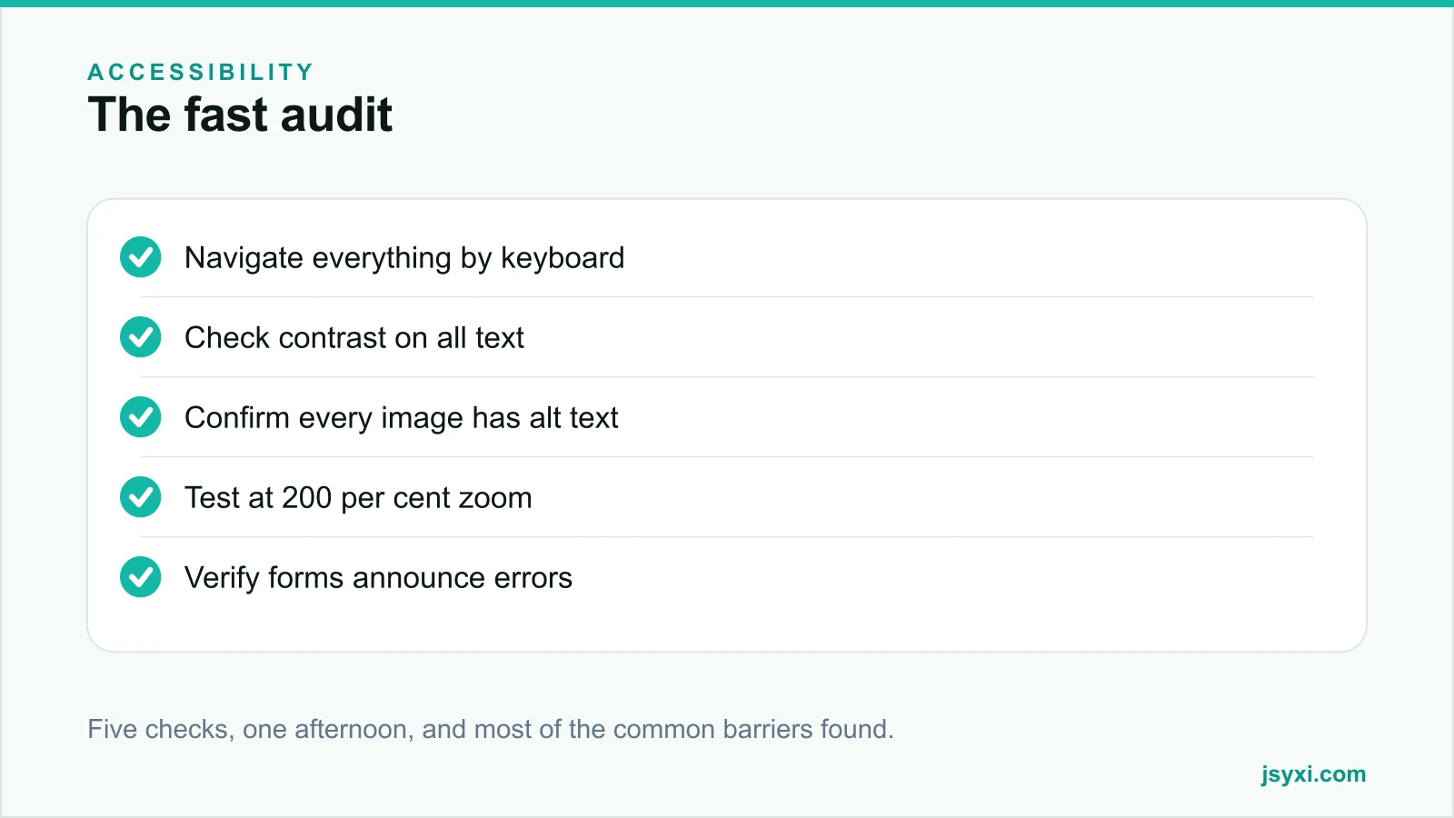
Accessibility is often treated as a specialist project that never quite starts. In practice, a small team can find and fix most of the real barriers on a website in an afternoon, using no specialist tools.
This checklist covers those checks, and the widget behaviours that most often lock people out.
Why it matters beyond compliance
- A significant share of people have a permanent disability, and many more have temporary or situational ones - a broken arm, bright sunlight, a noisy room
- Accessible sites are usually clearer for everyone
- Many accessibility fixes overlap with usability and SEO work
- In several jurisdictions, accessibility obligations apply to commercial websites
The standard most rules point to is WCAG. Level AA is the usual target. You do not need to memorise it to make real progress.
Check 1: Keyboard access
Unplug your mouse and navigate the whole site with Tab, Shift+Tab, Enter, Space, and the arrow keys.
Confirm:
- You can reach every interactive element
- The focus indicator is always visible and has adequate contrast
- The tab order follows the visual order
- You can open and close every menu, accordion, modal, and lightbox
- You are never trapped - a modal must be escapable
- A skip link lets you jump past navigation to the content
If you cannot complete a purchase or submit a form with the keyboard alone, that is the highest-priority fix on the list.
Check 2: Colour and contrast
- Body text needs a contrast ratio of at least 4.5:1 against its background
- Large text needs at least 3:1
- Interface components and focus indicators need at least 3:1
- Never use colour alone to convey meaning - errors, required fields, status, and chart series all need a second cue
Check the places that are usually missed: placeholder text, disabled buttons, text over images, and light grey captions.
Check 3: Text alternatives
- Every meaningful image has alt text describing what it shows
- Decorative images have an empty alt attribute so screen readers skip them
- Icons that act as buttons have accessible names
- Charts and infographics have a text summary of what they show
- Video has captions; audio has a transcript
Never bake important text into an image. It cannot be read aloud, translated, searched, or resized.
Check 4: Forms
Forms are where most sites fail hardest:
- Every input has a visible label, programmatically associated with it
- Placeholder text is never the only label
- Required fields are marked in text, not only with a colour or an asterisk
- Errors are announced, described in words, and placed beside the field
- Error messages explain how to fix the problem
- Related inputs are grouped with a group label
- The form can be completed with the keyboard alone
Our contact form guide covers the usability side of the same work.
Check 5: Zoom and reflow
Set your browser to 200 per cent zoom and use the site:
- Nothing is cut off or overlapping
- No horizontal scrolling is required to read text
- Sticky headers do not consume the whole screen
- Modals remain usable and closable
Then try 400 per cent on a narrow window. Content should reflow into a single column rather than break.
Check 6: Motion and timing
- Nothing autoplays with sound
- Carousels can be paused, and do not rotate faster than a person can read
- Animation respects the reduced-motion preference
- Nothing flashes rapidly
- Time limits can be extended or turned off
Autoplaying carousels are simultaneously an accessibility failure and a conversion failure.
Check 7: Structure and semantics
- One H1 per page, then a logical heading hierarchy with no skipped levels
- Headings describe structure, not visual size
- Lists are marked up as lists
- Landmark regions - header, navigation, main, footer - are used
- The page has a descriptive title and a declared language
- Link text makes sense out of context; "click here" does not
Widgets: where accessibility usually breaks
Third-party embeds are the most common source of new barriers:
- Modals and lightboxes must trap focus while open and restore it on close
- Accordions must toggle with Enter or Space and announce their state
- Sliders and drag interactions need a keyboard alternative
- Chat launchers must be reachable, labelled, and dismissible
- Cookie and consent banners must receive focus and be escapable
- Carousels must not autoplay without a pause control
Before adding any widget, test it with the keyboard alone. An Accessibility Toolbar lets visitors adjust text size and contrast, but it is an addition to accessible markup, not a substitute for it.
Common mistakes to avoid
- Removing the focus outline because it looked untidy. It is how keyboard users navigate.
- Placeholder-only labels. They vanish when typing starts.
- Colour-only error states.
- An overlay widget marketed as instant compliance. These do not fix underlying markup and are widely criticised.
- Auditing once and never again. Every new page and widget can reintroduce barriers.
Frequently asked questions
What accessibility standard should I follow?
WCAG at Level AA is the usual target and the level most regulations reference. You do not need to read the specification to start - the checks above cover the majority of real-world barriers.
Do accessibility overlays make my site compliant?
No. Overlay widgets do not fix the underlying markup, are widely criticised by disabled users, and have been cited in legal complaints. Fix the site itself.
Does accessibility help SEO?
Indirectly and meaningfully. Alt text, heading structure, descriptive links, and semantic markup all help search engines understand a page, and accessible pages tend to be clearer for everyone.
How do I test accessibility without specialist tools?
Navigate with the keyboard alone, check contrast with a free checker, zoom to 200 per cent, and read the page with your browser's built-in screen reader. That combination finds most common problems.
Next steps
Spend one afternoon on the five checks above for your homepage, a product page, and your checkout. Fix keyboard access first - it is usually the barrier that stops people completing a purchase.
Start free and check every widget you add with the keyboard before you publish it.