
Ideas for better growth
What Belongs Above the Fold on a Homepage
Chris Content · · 5 min read
The first screen decides whether visitors stay. What to include, what to cut, and how to test whether your hero is doing its job on a real phone.
The first screen is not where you win a customer. It is where you avoid losing one. A visitor arrives with a question - can this business do the thing I need? - and the first screen either answers it or sends them back to the results page.
This guide covers what earns a place above the fold, what does not, and how to check the difference honestly.
The fold still exists, just not where you think
"Above the fold" no longer means a fixed pixel height. It means whatever a visitor sees before deciding to scroll, on their device, with their browser chrome, at their text size.
On a typical phone that is a surprisingly small area, and a sticky header, a cookie banner, and a promo bar can eat half of it. Measure your real first screen on a mid-range phone rather than on a large desktop monitor.
The five things that earn the space
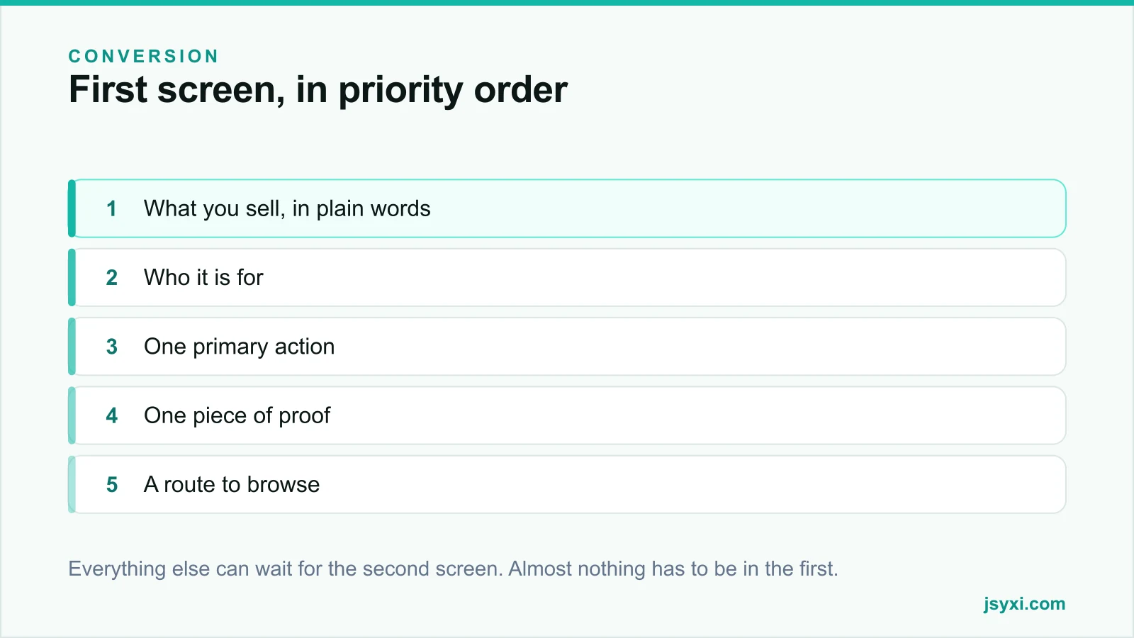
In priority order:
- What you sell, in plain words. Not a slogan. A visitor should be able to describe your business after five seconds.
- Who it is for. A qualifier removes the wrong visitors and reassures the right ones: "for Shopify stores", "for clinics in Pune", "for teams of 5 to 50".
- One primary action. Buy, browse, enquire, book. One. A second competing button reduces the click rate of the first.
- One piece of proof. A named client, a rating with a real count, a specific number. One line, not a logo wall.
- A route to browse. Navigation or a category entry point, for people not ready for the primary action.
That is the whole list. Everything else is second-screen material.
What does not belong
- A carousel of rotating banners. Only the first slide is seen by most visitors, and rotation moves content away mid-read.
- A full-screen video with no controls. It is heavy, it distracts, and it delays the headline.
- An immediate popup. Interrupting before the visitor has read anything is the fastest way to a bounce. See popups that convert without annoying visitors.
- A logo wall. Move it below; one named reference above is stronger than twelve grey logos.
- Award badges from 2019. Old proof reads as no recent proof.
- A mission statement. Nobody arrives wanting your mission.
Write the headline like a person
Most homepage headlines fail because they describe an aspiration rather than an offering. Test yours against three questions:
- Would a competitor's site work equally well with this headline? If yes, it says nothing.
- Does it contain a word your customers would not use? Replace it.
- Can someone unfamiliar with your industry understand it? If not, it filters the wrong people.
"Handmade cotton bedsheets, shipped across India in 3 days" beats "Redefining comfort". One is a business; the other is a mood.
Our guide to landing page copy goes deeper on structure.
Make the primary action unmistakable
- Label it with the action and the outcome: "Get a quote", "See pricing", "Book a fitting"
- One visually dominant button; make any secondary action visually quieter
- Keep it visible without scrolling on a phone
- Make it big enough for a thumb, with space around it
- Never place it where a sticky bar will cover it
If your primary action is an enquiry, a short contact form inline can outperform a button that leads to a separate page.
Protect the load
A slow first screen is a broken first screen. The headline should be text, not an image. The hero image should be sized for the device and should not push the headline down while it loads.
- Reserve space for the hero image so nothing shifts
- Preload only the single image that appears first
- Do not let a chat widget, a promo bar, or a consent banner render before the headline
- Keep fonts from blocking text rendering
Our post on Core Web Vitals with third-party widgets covers the mechanics.
How to test whether it works
Two cheap tests, both better than an opinion:
The five-second test. Show the first screen to someone unfamiliar with your business for five seconds, then ask: what does this company sell, who is it for, and what would you do next? If they cannot answer all three, the screen has failed.
The thumb test. Load the homepage on a mid-range phone on a normal connection. Without scrolling, can you read the headline, see the action, and tap it comfortably?
Then measure: scroll depth past the first screen, click rate on the primary action, and bounce rate for new visitors from search.
Common mistakes to avoid
- Two equally weighted calls to action. Choose.
- A headline that only makes sense if you already know the brand.
- Sticky elements stacking up. Header, promo bar, cookie banner, chat launcher - suddenly the content is a strip.
- Testing only on desktop. Most of your traffic is not on desktop.
- Changing the hero every quarter without measuring. You will never know what worked.
Frequently asked questions
How long should a homepage headline be?
One line that a stranger can read and understand in about three seconds - usually six to twelve words. If it needs a second line, that line should be a supporting sentence, not more headline.
Should the homepage have one call to action or several?
One primary action, visually dominant. Secondary routes should exist but must be quieter. Two equally weighted buttons split attention and reduce total clicks.
Is a hero carousel bad for conversion?
Usually. Most visitors see only the first slide, rotation moves content away while being read, and each additional slide adds weight. A single strong hero with one message performs better in most tests.
What about the cookie banner and promo bar?
Count them as part of the first screen, because they occupy it. If a banner, a bar, and a header together push your headline off a phone screen, something has to go.
Next steps
Load your homepage on a phone, screenshot the first screen exactly as it appears, and check it against the five items above. Cut anything that is not one of them, then run the five-second test on someone outside your team.
Start free and rebuild your first screen around one clear promise.