
Ideas for better growth
Landing-Page Copy That Converts: Headline, Offer, CTA, Proof, and Objections
Chris Content · · 6 min read
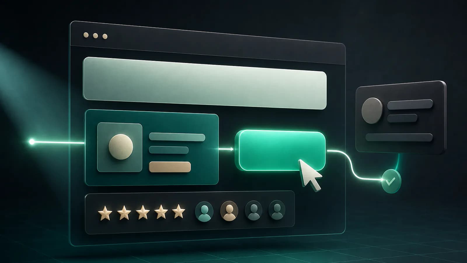
A practical framework for writing landing pages in the order visitors decide: clear headline, concrete offer, focused CTA, relevant proof, and honest answers to objections.
Landing-page copy is not a speech. It is a guided decision.
A visitor arrives with limited context and a private list of questions: Is this for me? What will I get? Why should I believe you? What happens if it is not a fit? What should I do next?
The strongest pages answer those questions in roughly the order they appear. They do not begin with the company's origin story, stack every possible benefit above the fold, or use louder adjectives when the offer is unclear.
Use this five-part structure to write a page from scratch or diagnose one that is underperforming.
1. Headline: make the page identifiable
The headline's first job is orientation. A visitor should understand what the page offers and why it matters without decoding a slogan.
A useful headline often combines:
Outcome + audience or context + meaningful distinction
Weak:
Unlock the future of effortless growth
Clearer:
Launch product-review widgets on your store with a lightweight embed
The clearer version does not promise a business result it cannot guarantee. It names the thing, the audience context, and the friction removed.
Before choosing a headline, write answers to three questions:
- Who is this page for?
- What progress are they trying to make?
- What makes this route easier, safer, faster, or more suitable?
Then remove words that could belong to any competitor: innovative, seamless, world-class, cutting-edge, revolutionary. Replace them with evidence.
2. Offer: turn the promise into something concrete
The offer is what the visitor receives in exchange for money, time, information, or attention. “Grow your business” is an aspiration, not an offer.
Define:
- the product, service, demo, download, or consultation;
- what is included;
- who it is best suited to;
- how delivery or access works;
- the price or next pricing step, when appropriate;
- any real limits, prerequisites, or exclusions.
For example, a vague agency offer says:
Get a custom digital solution tailored to your needs.
A concrete version says:
Book a 30-minute storefront review. We will examine your product page, lead capture, and mobile purchase path, then recommend the three highest-priority fixes.
Only promise that format if it matches the actual service. Specific copy creates an operational commitment, so confirm it with the team delivering the offer.
3. CTA: describe the next step
A call to action works best when the label and supporting copy make the next step predictable.
Generic labels such as “Submit” or “Learn more” place the interpretation work on the visitor. Prefer labels connected to the action:
- Start building free
- Try the widget live
- Request a project quote
- Book a consultation
- Get the sizing guide
If the action requires commitment, explain it nearby. “Book a consultation” may need supporting text such as “Choose an available IST slot; no payment required.” A form can state how the information will be used and when the visitor can expect a response.
For lead capture, test the smallest form that still supports a useful follow-up. A form widget can route submissions to the relevant team; the copy around it should explain why each non-obvious field is needed.
4. Proof: support the claim beside it
Proof is not a decorative logo strip. It is evidence that helps a visitor believe a specific claim.
Different claims need different proof:
- Quality: detailed customer reviews, samples, demonstrations, or process standards.
- Ease: a live product demo, setup steps, or a short walkthrough.
- Experience: relevant case studies, team credentials, or completed work.
- Reliability: clear support commitments, status information, or delivery process.
- Fit: examples from the visitor's industry, use case, or store platform.
If your headline promises easy setup, let visitors try a tool live or show the installation steps. If you claim customers value a product, place authentic reviews beside the claim. If an outcome varies, explain the conditions rather than implying certainty.
Do not invent customer counts, performance lifts, ratings, partner status, or certifications. Keep the source and date for every metric you publish.
5. Objections: answer the reason to delay
Objections are unanswered questions, not negativity. Interview sales and support teams to learn what people ask before buying.
Common categories include:
- price and total cost;
- time to launch;
- required technical skill;
- compatibility with an existing store or workflow;
- cancellation, returns, or switching;
- data handling and access;
- support after purchase;
- whether the product suits a particular use case.
Answer the highest-impact objection in the main flow. Put the rest in a concise FAQ widget, linked policy, comparison, or consultation prompt.
Avoid evasive FAQ copy:
Question: How much does it cost?
Weak answer: Every business is unique. Contact us.
If a fixed price is impossible, explain the pricing mechanism:
Projects are quoted after a discovery call. Scope, integrations, content readiness, and timeline affect the quote; you receive a written, GST-inclusive proposal before work begins.
That answer does not reveal a price, but it reduces uncertainty.
Put the sections in decision order
A practical landing-page sequence is:
- Headline and short explanation.
- Primary CTA with commitment-reducing note.
- Immediate proof or product demonstration.
- Outcomes and key offer inclusions.
- How it works.
- Relevant proof in more depth.
- Objections and FAQ.
- Final CTA that repeats the same next step.
A worked example
Imagine a landing page for a made-to-order office desk.
The original hero says, “Transform your workspace,” followed by a “Shop now” button. It does not explain dimensions, delivery, assembly, or why the desk costs more than a mass-market alternative.
A clearer version might lead with:
A made-to-order solid-wood desk sized for your workspace
The supporting copy can name the finish choices, expected production range, delivery area, and what assembly includes. The CTA could be “Choose your desk size.” Proof should show real material details and customer installations. Objections about lead time, care, customization, and returns should appear before the final CTA.
Notice what the rewrite does not do: it does not guarantee productivity, call the desk “premium” five times, or hide the production wait. It makes the buying decision easier.
Final copy checklist
- The headline identifies the offer and intended audience.
- The opening explains a concrete outcome without an unsupported guarantee.
- The offer states what is included and how it works.
- The primary CTA describes the next step.
- Supporting copy reduces uncertainty about commitment and response.
- Each important claim has relevant proof nearby.
- Reviews, metrics, and credentials are genuine and current.
- The page answers the most common purchase objections.
- Price, timing, delivery, and limitations are as clear as the model allows.
- The final CTA matches the action introduced at the top.
- The mobile version remains scannable and the form is usable.
Once the message is clear, use tools such as forms, reviews, popups, and FAQs to place the right prompt or proof at the right moment. If you want a second set of eyes on the whole page, book a free consultation and we will review the offer, decision path, and conversion friction with you.