
Ideas for better growth
Image Optimization for Websites: A Complete Guide
Chris Content · · 5 min read
Formats, sizing, compression, responsive delivery, lazy loading, and alt text - a practical workflow that makes images fast without making them look bad.
Images are usually the largest part of a web page by bytes, and the easiest thing to get badly wrong. A photo straight from a phone camera can be several megabytes; the same photo, correctly prepared, can be under a hundred kilobytes and look identical on screen.
This is the workflow.
Step 1: Crop to purpose
Before any technical work, decide what the image is for and crop accordingly:
- A product thumbnail needs the product filling the frame
- A hero needs a safe area where text will sit
- A team photo needs consistent framing across everyone
- A blog cover needs to survive being cropped to different ratios
Cropping is also compression: removing irrelevant background reduces both file size and cognitive load.
Standardise aspect ratios per use. Consistent ratios prevent ragged grids and make layout reservation trivial.
Step 2: Resize to display size
The most common mistake is uploading at camera resolution and letting CSS shrink it. The browser still downloads every pixel.
- Determine the largest size the image is actually displayed at
- Export at roughly twice that for high-density screens
- Do not exceed that; a thumbnail shown at 400px does not need 4000px
- Generate a small set of widths for responsive delivery rather than one huge file
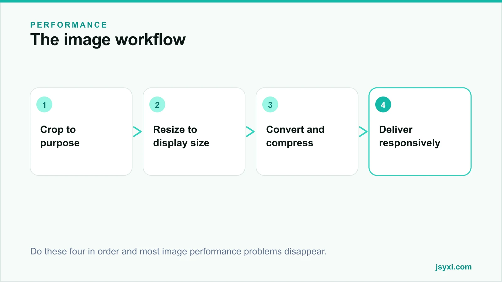
Step 3: Choose the right format
- WebP - the sensible default for photos and graphics. Broad support, substantially smaller than JPEG at equivalent quality.
- AVIF - smaller still, with slightly narrower support and slower encoding. Good for large hero images where the saving is worth it.
- JPEG - the universal fallback for photographs.
- PNG - only when you need lossless output or genuine transparency in a non-photographic image.
- SVG - for logos, icons, and diagrams. Resolution-independent and usually tiny. Sanitise any SVG you did not create.
Avoid GIF for anything but the smallest animations; a short video file is dramatically smaller.
Step 4: Compress with judgement
Quality settings are not linear. For most photographs, a WebP quality setting in the mid-seventies to mid-eighties is visually indistinguishable from the original at typical viewing sizes, at a fraction of the bytes.
- Compare at the actual display size, not zoomed to 400 per cent
- Push harder on background and decorative images
- Be gentler on product detail shots where texture is the point
- Strip metadata - camera information can be tens of kilobytes per image
- Watch for banding in gradients, which is where over-compression shows first
Step 5: Deliver responsively
Serve a phone a phone-sized image:
- Provide multiple widths and let the browser choose
- Describe the layout accurately so the browser picks correctly
- Use art direction where the crop should change between phone and desktop, not just the size
- Serve modern formats with a fallback for older browsers
Most platforms and image CDNs do this automatically. Confirm it is actually happening by inspecting what a phone downloads.
Step 6: Load at the right time
- Lazy load everything below the fold
- Never lazy load the largest element in the first screen; it delays exactly what is being measured
- Preload only the single hero image, if any
- Decode asynchronously so image decoding does not block interaction
Step 7: Reserve the space
Always set explicit dimensions or an aspect ratio. This single practice prevents most layout shift:
- The browser can allocate the space before the image arrives
- The page does not jump under a reader's thumb
- Grids stay aligned while loading
Step 8: Write alt text
Alt text is an accessibility requirement and an image-search input:
- Describe the subject and the relevant detail
- Skip "image of" and "photo of"
- Keep it reasonably short - roughly a sentence
- Use an empty alt attribute for decorative images so screen readers skip them
- Never stuff keywords; it reads badly when announced aloud
For product images, describe what distinguishes this image from the others in the set.
Step 9: Name files sensibly
Descriptive, hyphenated filenames help image search and help your team:
- "walnut-dining-table-six-seater.webp" beats "IMG20260114113245.webp"
- Keep them lowercase and hyphen-separated
- Do not rename files after publishing unless you redirect them
Step 10: Audit periodically
Image discipline decays as more people upload content:
- Check the heaviest pages quarterly
- Look for uploads that bypassed your pipeline
- Confirm responsive variants are actually being served
- Watch total page weight against your budget
Common mistakes to avoid
- Uploading at full camera resolution. The single biggest cause of slow pages.
- Using PNG for photographs. It is many times larger with no visible benefit.
- Lazy loading the hero. It delays the metric you are trying to improve.
- No width and height attributes. Guaranteed layout shift.
- Keyword-stuffed alt text. Bad for users, and not effective anyway.
Frequently asked questions
What is the best image format for the web?
WebP is the sensible default for photos and graphics. AVIF is smaller still where support and encoding time allow. Keep JPEG as a fallback and use SVG for logos, icons, and diagrams.
How much should I compress images?
Enough that the file is small and the difference is invisible at display size - for most photos that is a WebP quality setting in the mid-seventies to mid-eighties. Compare at actual size, not zoomed in.
Should all images be lazy loaded?
No. Lazy load everything below the fold, but never the largest element in the first screen. Lazy loading the hero delays exactly the content the browser should prioritise.
Does image alt text help SEO?
It helps image search and, more importantly, it is an accessibility requirement. Describe the image accurately; do not use it as a keyword slot.
Next steps
Take your three heaviest pages, find the largest image on each, and run it through crop, resize, convert, compress. Then add width and height attributes everywhere so the layout stops shifting.
Start free and keep the widgets on those pages light too.