
Ideas for better growth
Pricing Page Design: A Practical Guide
Chris Content · · 4 min read
How many plans, how to name them, what to show and hide, and how to handle the questions that stop people choosing. A guide to pricing pages that convert.
A pricing page is a decision page, not a specification sheet. The visitor arrived with one question - what will this cost me - and a secondary one they may not articulate: which of these am I?
Most pricing pages answer the first badly and the second not at all.
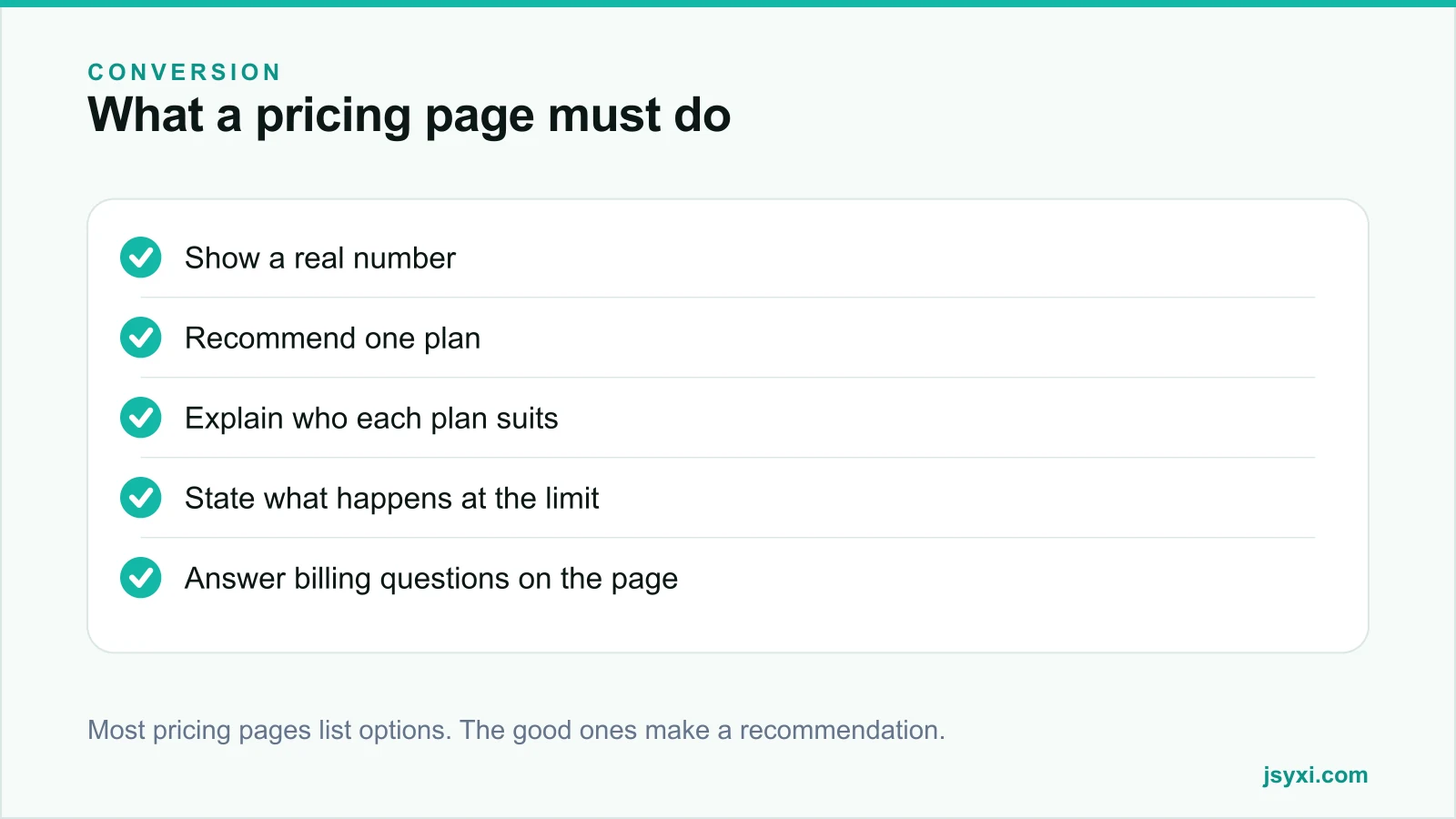
Step 1: Show a real number
The most common failure is no price at all. "Contact us for pricing" removes you from consideration for a large share of visitors who will not start a sales conversation to learn a number.
If your pricing genuinely varies:
- Publish a starting price - "from Rs 12,000"
- Publish a typical range with what drives it
- Offer a price calculator for an instant estimate - see our calculator guide
Publishing a range also filters out enquiries you would have rejected, which saves your sales team more time than the enquiries you lose.
Step 2: Limit the plans
Three plans is the practical sweet spot for most businesses. Two can feel like a false choice; five or more shifts the work of deciding onto the visitor.
If you genuinely have more, group them: three tiers on the page with a link to a full comparison for the rare visitor who needs it.
Step 3: Name plans by who they are for
Plan names should help someone self-identify:
- "Starter", "Growth", "Agency" works because each names a stage
- "Bronze", "Silver", "Gold" tells the visitor nothing except which is expensive
- Adding a one-line audience description under each name does more than the name itself: "For a single store doing under 10,000 views a month"
Step 4: Recommend one
Neutral presentation is not helpful. Mark one plan as recommended, and say why:
- "Most popular" only if it is true
- "Best for most stores" with a reason
- Make the recommended plan visually distinct without hiding the others
Visitors want guidance. A page that refuses to give any leaves the choice to guesswork, and guesswork often resolves as leaving.
Step 5: Show what actually differs
- List features in the same order across all plans
- Put the differences first, not the twelve things every plan includes
- Use plain labels; internal feature names mean nothing to a buyer
- Show limits as numbers, not "unlimited*" with an asterisk
- If something is an add-on, say so and give its price
A comparison table style breakdown below the plan cards works well: cards for scanning, table for the visitor who wants detail.
Step 6: Answer what happens at the limits
This is the question that stops people choosing, and most pricing pages ignore it:
- What happens when I exceed the limit? Is it blocked, throttled, or billed?
- Can I upgrade mid-cycle, and how is it prorated?
- Can I downgrade, and what happens to my data?
- Is there a contract, and how do I cancel?
- What happens at the end of a trial?
A visitor who cannot predict the consequence of growing chooses the safest option, which is often no option.
Step 7: Handle the billing questions inline
Put an FAQ accordion directly on the pricing page covering:
- Taxes - whether prices include GST
- Payment methods accepted
- Refund policy
- Billing frequency and annual discounts
- What support is included at each tier
Answering these on the page removes the most common reason people leave to "think about it".
Step 8: Give one primary action per plan
- The same action verb on every plan card
- "Start free" or "Choose Growth" rather than "Submit"
- A secondary route for people not ready - talk to sales, or a demo
- Do not make the enterprise tier's only route a twelve-field form
See our guide to call-to-action buttons.
Step 9: Put proof next to price
Price is where doubt peaks, so proof belongs here:
- A named customer quote about value
- A logo showcase of comparable businesses
- A guarantee or trial with plain terms
- A counter with a real, sourced number
Our post on social proof placement covers which evidence answers which doubt.
Common mistakes to avoid
- No price at all. You are eliminated before the conversation starts.
- Five plans with no recommendation. The visitor does the work and often leaves.
- "Unlimited" with an asterisk. It reads as a trap.
- Feature lists in different orders per plan. Comparison becomes impossible.
- No answer to what happens at the limit. It is the question that blocks the decision.
Frequently asked questions
How many pricing plans should I show?
Three for most businesses. Two can feel like a false choice, and five or more moves the burden of deciding onto the visitor. Group extra tiers behind a full comparison link.
Should I show prices if my pricing is complex?
Yes - a starting price, a typical range, or an instant calculator. Publishing nothing removes you from consideration for visitors who will not enquire just to learn a number.
Should I highlight a recommended plan?
Yes, and say why. Neutral presentation leaves visitors guessing. Mark one plan as best for most customers, with a one-line reason.
What should a pricing FAQ cover?
Tax treatment, payment methods, upgrade and downgrade behaviour, what happens at plan limits, refunds, and cancellation. These are the questions that otherwise end the visit.
Next steps
Add a one-line audience description under each plan name, mark one as recommended with a reason, and publish an FAQ accordion on the page answering the five billing questions you get most.
Start free and put a real number in front of your visitors.