
Ideas for better growth
How to Add a CTA Button That Gets Clicked
Chris Content · · 4 min read
Button copy, placement, size, and contrast decide whether an action happens. A practical guide to designing call-to-action buttons that people actually press.
A call-to-action button is the smallest element on a page carrying the largest share of the outcome. Most of them are labelled "Submit" or "Learn more", styled to match five other buttons on the page, and placed below the fold on a phone.
This guide covers the four things that decide whether a button gets pressed: what it says, where it sits, how it looks, and what it promises.
1. Write the label as an outcome
The label should complete the sentence "I want to...".
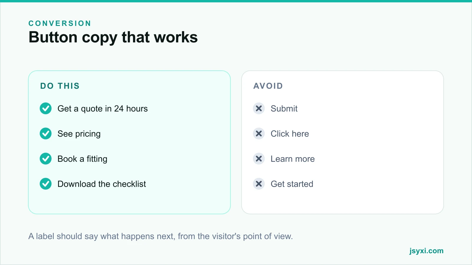
- "Get a quote in 24 hours" beats "Submit"
- "See pricing" beats "Learn more"
- "Book a fitting" beats "Contact us"
- "Download the checklist" beats "Click here"
Two rules make labels better:
- Use the visitor's verb, not your process. They are not "submitting an enquiry"; they are asking for a price.
- Name the value, not the effort. "Start free" is better than "Register account".
Keep it to two to four words where you can. If the label needs a qualifier - "no card required", "takes 2 minutes" - put it as a small line beneath the button rather than inside it.
2. Have one primary action per screen
The most common failure is not a weak button; it is three equally weighted ones.
- One visually dominant primary button per screen
- Secondary routes styled as outlined buttons or text links
- Never place two filled buttons of the same colour side by side
- If a page genuinely has two audiences, split them clearly rather than competing
Two equally weighted buttons split attention and reduce total clicks on both. See what belongs above the fold.
3. Place it where the decision is made
A button works where conviction peaks, which is not always at the bottom:
- After the offer is explained, not before
- Repeated on long pages - once in the hero, once after the proof, once at the end
- Beside the objection it answers - a "See delivery options" action next to shipping information
- Never covered by a sticky bar on mobile
Test with the on-screen keyboard open. A chat launcher or consent banner sitting on the primary action is a silent revenue leak - see our mobile checkout checklist.
4. Make it look pressable
- Contrast. The primary button should be the highest-contrast interactive element on the screen, and must still meet contrast requirements against its background.
- Size. Large enough for a thumb, with clear space around it so nothing else is hit by accident.
- Shape consistency. Use the same shape language for the same level of action across the site.
- Obvious affordance. A filled rectangle reads as pressable; a bare word does not.
- Never rely on colour alone to signal which action is primary - weight and size should carry it too.
5. Build it without editing your theme
The Custom Button widget supports link, call, email, scroll, and copy actions, which covers most cases without a developer:
- Link for navigation to a page or offer
- Call for tap-to-dial, which outperforms a form for urgent services
- Email where a direct message is the natural route
- Scroll to jump to a form further down a long page
- Copy for coupon or reference codes
Place it with the embed snippet guide.
6. Make the destination match the promise
The most damaging button problem is not the label - it is a mismatch:
- "See pricing" must land on prices, not a contact form
- "Book a fitting" must open a booking step, not a generic enquiry page
- "Download the checklist" must download, not gate behind five fields
If the label promises one thing and the next screen does another, you have spent the click and lost the trust. Our lead capture best practices covers how much to ask for at that point.
7. Measure the button, not the page
- Click rate on each button instance, separated by position
- Completion rate after the click, which is the number that matters
- Device split, since mobile placement problems hide in an average
- Whether repeated buttons on long pages get used, and which position wins
A button with a high click rate and a low completion rate is a promise the next screen is not keeping.
Common mistakes to avoid
- "Submit". It describes your database, not their goal.
- Two primary buttons. Attention splits, clicks fall.
- Below the fold on mobile with no repeat. Most visitors never see it.
- Label and destination mismatch. The most expensive kind of click.
- Low contrast for aesthetic reasons. A button nobody notices is a button nobody presses.
Frequently asked questions
What makes a good call-to-action button?
An outcome-based label in the visitor's words, one primary action per screen, high contrast, a comfortable tap size, and a destination that delivers exactly what the label promised.
What colour should a CTA button be?
Whichever colour has the strongest contrast against its surroundings while meeting accessibility requirements. There is no universally best colour - what matters is that it is clearly the most prominent interactive element.
How many CTAs should a page have?
One primary action, repeated as often as the page is long. Secondary routes should exist but must be visually quieter so they do not compete.
Should a CTA button say "Submit"?
No. Replace it with what the visitor gets: "Get a quote", "Book a call", "See pricing". Generic labels measurably underperform outcome-based ones.
Next steps
Rewrite the label on your single most important button as an outcome, make sure nothing covers it on a phone, and check that the next screen delivers exactly what it promised.
Start free and publish one with the Custom Button widget.