
Ideas for better growth
Mobile Checkout UX: A Practical Checklist
Chris Content · · 5 min read
Most orders are placed one-handed on a phone. A checklist for keyboards, autofill, validation, payment failure, and the sticky bars that break checkout.
Checkout is usually designed on a large monitor with a mouse, a fast connection, and a test card that always succeeds. It is then used one-handed, on a mid-range phone, on patchy mobile data, by someone whose payment might fail.
This checklist covers the details that decide whether that person completes the order.
Set up an honest test
Before auditing, recreate the real conditions:
- A mid-range Android phone, not a flagship
- A throttled connection
- A fresh browser profile with no saved session
- Autofill enabled, as most real users have
- One hand, thumb only
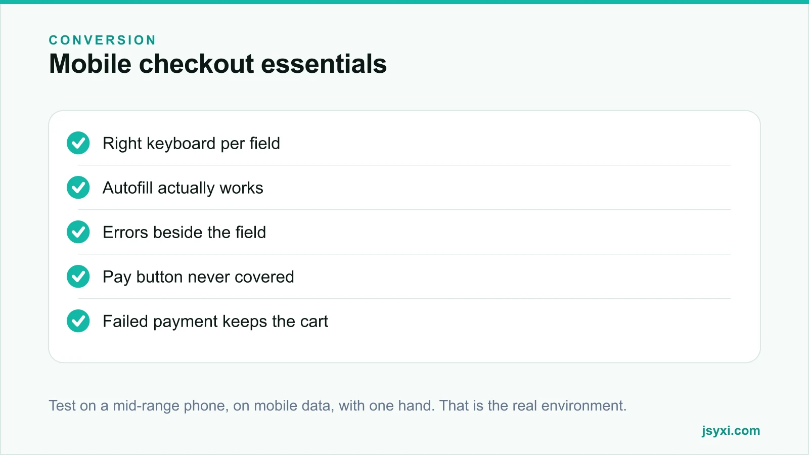
Complete a real order end to end, including a deliberate payment failure. Almost every checkout has at least one problem that only appears under these conditions.
Layout and flow
- One column. Side-by-side fields break on narrow screens.
- Show progress. Two or three named steps, with the current one obvious.
- Keep the order summary reachable - collapsed by default, expandable, always showing the total.
- Remove navigation. No menu, no footer links, no social icons inside the flow.
- Never open a new tab during checkout.
Fields and keyboards
Every field should trigger the right keyboard and accept the input people actually type:
- Email fields open the email keyboard with the @ key
- Phone fields open a numeric keypad
- PIN code fields open a numeric keypad and accept exactly the expected length
- Name fields do not force capitalisation rules
- Address fields accept multiple lines and long strings
Auto-fill city and state from the PIN code, and let the customer correct it. That removes two fields and two errors.
Autofill
Browser autofill completes a checkout in seconds when it works, and does nothing when field names are non-standard:
- Use standard autocomplete attributes for name, email, phone, address, city, postal code
- Do not split a single logical field across multiple inputs in ways autofill cannot map
- Test with a real saved profile, not an empty one
If your checkout does not autofill, you are adding thirty seconds of thumb typing to every order.
Labels and validation
- Labels above fields, always visible. Placeholder-only labels disappear as soon as typing starts and are a known accessibility failure.
- Validate on blur, not on every keystroke.
- Errors beside the field, in plain language, saying how to fix it.
- Never clear entered data on error.
- Do not reject valid formats. Phone numbers with spaces or country codes are valid. Clean them server-side.
- Never signal errors with colour alone.
Touch targets and spacing
- Minimum comfortable tap size for every interactive element
- Enough vertical space between fields that a thumb does not hit the wrong one
- No critical action within the area a thumb naturally covers when scrolling
- Radio buttons and checkboxes with a tappable label, not just the box
The sticky bar problem
The most common mobile checkout bug is an element covering the pay button:
- A sticky chat launcher over the bottom-right corner
- A cookie banner pinned to the bottom
- A promo bar that reappears on scroll
- The browser's own bottom chrome
Test with the keyboard open, because the viewport shrinks and a sticky footer can land directly on the submit button. If a visitor cannot tap pay, nothing else matters.
Payment
- Show all available methods before the final step
- Put the most-used method first for your market
- Keep the cart and address intact if payment fails
- Explain the failure in plain language and offer a retry with a different method
- Confirm success immediately and unambiguously, with an order number
A silent failure is indistinguishable from a crash, and the customer will not try again.
After the order
- Show a confirmation page with the order number, items, total, and delivery estimate
- Send a confirmation message on the channel the customer used
- Give a tracking route that does not require an account
- Offer support clearly, ideally a WhatsApp route
Performance
Checkout should be the lightest part of your site:
- No analytics or marketing scripts that block rendering
- No third-party embeds that are not essential to payment
- Reserve space for anything that loads late so nothing shifts under a thumb
- Measure the real page weight - see measuring widget performance
Common mistakes to avoid
- Placeholder-only labels. They vanish exactly when needed.
- A chat widget over the pay button. Test with the keyboard open.
- Clearing the form on error. Customers do not retype an address twice.
- Hiding the total until the last step. Show it throughout.
- Testing only with a successful payment. Failures are where checkouts break.
Frequently asked questions
Should mobile checkout be one page or multiple steps?
Either works. Multiple short steps with clear progress usually feel lighter on a phone than one long scroll, provided the total is always visible and going back does not lose entered data.
How many fields should a mobile checkout have?
Only those needed to fulfil and contact. Auto-derive city and state from the PIN code, skip company name for consumer stores, and ask for one contact route rather than two.
Why do mobile carts convert worse than desktop?
Usually friction rather than intent: harder typing, broken autofill, covered buttons, and higher payment failure rates on mobile connections. Each is fixable, and fixing them closes most of the gap.
Should I offer one-tap or wallet payments?
If your customers use them, yes. They remove the entire typing burden. Keep conventional methods available too, and show all options before the final step.
Next steps
Run one real order on a mid-range phone with a deliberate payment failure, and write down everything that annoyed you. Fix the covered pay button first, then autofill, then the error messages.
Start free and remove the friction between intent and order.