
Ideas for better growth
How to Use an Announcement Bar Well
Chris Content · · 4 min read

An announcement bar is the least intrusive way to say one thing site-wide. What belongs there, how long to leave it up, and how to avoid stacking banners.
An announcement bar is the gentlest interruption available: a thin strip at the top or bottom of every page carrying one message. Unlike a popup, it does not block anything. Unlike a hero banner, it does not compete for the main message.
That makes it easy to abuse. Most sites end up with a bar nobody reads, announcing something that ended two months ago.
What belongs in an announcement bar
Things that are true site-wide, time-bound, and useful:
- A live offer with clear terms - "Free delivery over Rs 999 until 31 August"
- A genuine delivery cut-off before a festival
- Temporary changes to hours or service
- A service disruption or delay notice
- A new launch, for a short period after launch
- A regulatory or safety notice you are required to display
What does not belong:
- Your value proposition, which is the hero's job
- A permanent "Sign up for our newsletter"
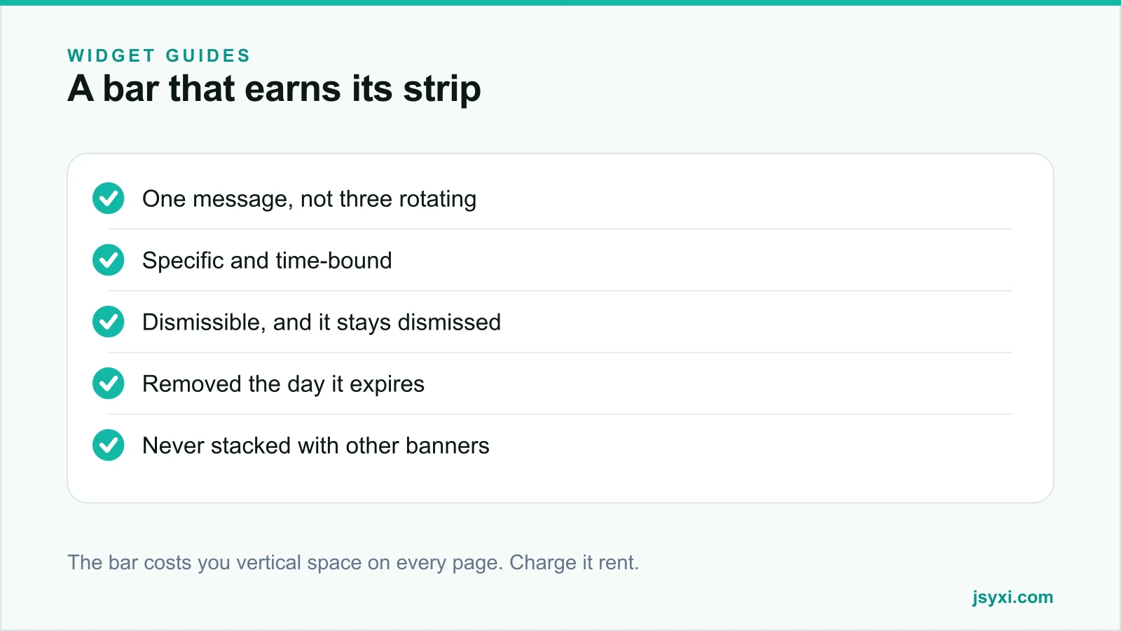
- Three messages rotating on a timer
- Anything so important it needs a whole page
Write it as one sentence
The bar is one line on a phone. Discipline is forced on you:
- State the offer or fact, not the excitement about it
- Include the condition - threshold, deadline, region
- Include one action, linked
- Skip the exclamation marks. They make a genuine offer read as spam
"Free delivery over Rs 999. Ends Sunday." with a link works. "🎉 HUGE SALE NOW ON!!! 🎉" does not, and it damages the surrounding page.
Do not rotate messages
A rotating bar is a slider in a smaller box, and it inherits the same problem: only the first message is read, and rotation moves text away mid-sentence.
If you have three things to announce, you have a prioritisation problem, not a display problem. Pick one. Put the others where they belong - the second on the relevant category page, the third in the footer.
Build it without editing your theme
The Popup and Announcement Bar widget runs in bar mode, at the top or bottom, with a heading, message, and call to action.
Configure:
- Position. Top for offers and notices; bottom competes with chat launchers and sticky actions.
- Dismissible, always, with a visible close control - and remember the dismissal for at least the session.
- Delay. None. A bar should be there on first paint or not at all.
- Colour. Distinct from your header, but not a colour that means "error" elsewhere on the site.
Place it with the embed snippet guide.
Watch the stacking problem
The top of a mobile screen fills fast. Count what is already there:
- Browser chrome
- Your sticky header
- A cookie or consent notice
- The announcement bar
- Sometimes a shipping notice from the platform
Four of those and your page content starts below the fold. Before adding a bar, screenshot the first screen on a real phone. If the headline is pushed off, something has to go - see what belongs above the fold.
Also reserve the bar's height so it does not push the page down after load. Layout shift at the top of the page is the worst kind.
Set an expiry before you publish
The single most common failure is a live bar advertising a finished sale.
- Decide the end date and time before publishing
- Put a calendar reminder on one person for the removal
- Where the bar carries a deadline, pair it with a real countdown that expires correctly - see honest urgency
- Include the removal in your monthly maintenance checklist
A stale bar tells every visitor that nobody is minding the site, and it makes your next genuine offer less believable.
Measure whether it works
- Click rate on the bar's action
- Conversion rate of sessions that clicked, versus those that did not
- Dismissal rate - a high one means the message is not relevant
- Whether the offer it advertises actually gets used
If the bar is dismissed by most visitors and clicked by almost none, it is costing vertical space on every page for nothing.
Common mistakes to avoid
- Rotating messages. Only the first is read.
- No dismiss control, or one that forgets the choice on the next page.
- Leaving it up after the offer ends. The most common and most damaging.
- Stacking it under a consent banner and a sticky header. The content disappears.
- Using it for your value proposition. That belongs in the hero.
Frequently asked questions
What should an announcement bar say?
One time-bound, site-wide fact with its condition and a single action: a delivery threshold, a cut-off date, a service change. Not your value proposition, and not three messages in rotation.
Should the announcement bar be at the top or bottom?
Top for offers and notices, where it is read first. The bottom of a mobile screen is already crowded with chat launchers, sticky actions, and browser chrome.
Should visitors be able to dismiss it?
Yes, with a visible close control, and the dismissal should persist across pages. A bar that reappears on every navigation reads as if you ignored the visitor.
How long should an announcement bar stay up?
Only as long as the message is true. Set the end date before publishing and put a reminder on one person to remove it - a bar advertising a finished sale damages trust in every other claim on the site.
Next steps
Pick the one message that is genuinely true site-wide this week, publish it with the Popup and Announcement Bar widget in bar mode, and set a calendar reminder for the day it expires.
Start free and keep the strip honest.