
Reducing Mobile Shopping Friction for an Independent Fashion Boutique
Illustrative case study: how a fashion boutique could simplify mobile discovery, sizing, variant selection, and checkout without losing its editorial character.
By jsyxiPublished
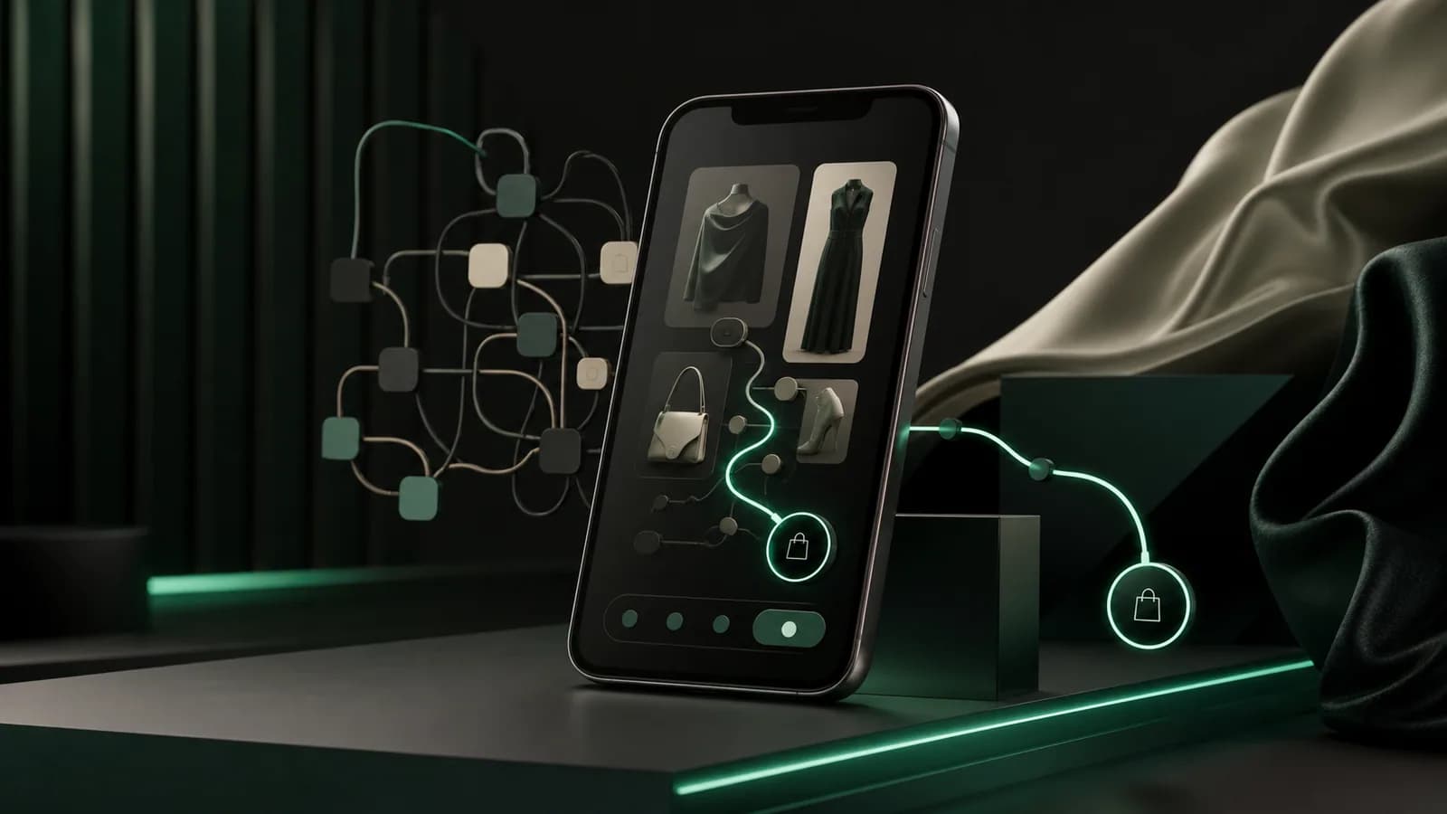
Illustrative case study: This is a representative scenario created to explain a practical approach. It is not a named customer claim, testimonial, or guarantee of results.
Context
Consider an independent fashion boutique whose audience discovers new collections through short-form video and social posts. Most campaign visits arrive on phones. The brand has a distinctive editorial identity, but its mobile storefront inherited a desktop-first theme: tall image blocks, compact filters, several overlapping sticky controls, and a size guide that opens away from the selected product.
Shoppers enjoy browsing, yet the path from inspiration to a confident size and variant choice is unnecessarily demanding. The team wants to reduce effort while protecting photography, brand voice, and the sense of discovery that makes the boutique memorable.
The challenge
Mobile friction rarely comes from one dramatic defect. It accumulates through small interruptions. A visitor opens a campaign link, dismisses a newsletter prompt, scrolls past a full-screen image, opens filters, loses the scroll position, selects a colour, waits for the matching image, and then searches for fit guidance. A sticky chat launcher and add-to-cart bar compete for the same space.
The store's analytics can show exits, but not why the visitor hesitated. Support messages add clues: customers ask whether an item runs true to size, whether a colour is represented accurately, and when an unavailable variant may return. The team frames the project around these decisions rather than a broad visual redesign.
Strategy
The team creates a mobile journey map for three common intents: arriving for a featured item, browsing a collection, and returning to a saved product. Each journey is tested on a physical phone with a fresh session, slower connection, increased text size, and no saved payment details.
Every screen element must earn its place. Editorial imagery remains important, but key product facts and the next useful action should not disappear beneath it. Interruptions are coordinated so the visitor sees one relevant prompt at a time. The scope is deliberately contained to collection and product templates plus their supporting drawers.
Implementation
Collection cards gain consistent image ratios, visible price and colour availability, and a clear indication when an item has multiple options. Filters use customer language, retain selections, and provide an obvious reset. Opening and closing the filter drawer preserves the visitor's place. Empty states suggest a relevant next route instead of ending the journey.
On the product page, the first mobile viewport balances the leading image with title, price, available colours, and a primary action. Swatches update the product image and availability together. Unavailable sizes are clearly disabled, while a stock notification route explains what the customer is requesting.
The size guide becomes an accessible drawer tied to the current product category. It combines garment measurements, fit notes, measurement instructions, and review context without claiming that one recommendation will fit every person. The team uses the Product Reviews tool to surface useful comments about cut and fabric beside the guide while retaining the full review context.
The cart summary shows the selected size, colour, image, delivery context, and a simple edit route. Popups use the Announcement Popup tool only for a relevant campaign and never cover checkout actions. The team removes duplicate scripts and compresses product media so interaction does not wait behind decoration.
Measurement plan
The baseline includes collection-to-product progression, filter use, product option errors, size-guide opens, add-to-cart completion, cart edits, checkout starts, page responsiveness, and the themes of sizing-related contacts and returns. The team separates new campaign visitors from returning customers and compares similar collections rather than mixing sale and full-price demand.
Session review looks for repeated taps, drawers that close unexpectedly, obscured actions, and layout movement. Merchandising and support review the same evidence weekly. A decrease in one interaction is not automatically a problem: fewer size-guide opens may be healthy if essential guidance is now visible earlier.
Guardrails
- No artificial low-stock or popularity messages
- Fit guidance explains its basis and preserves customer choice
- Colour names and images remain consistent across card, product, cart, and checkout
- Popups, chat, and sticky actions never compete for the same mobile space
- Keyboard, screen-reader, zoom, and reduced-motion behaviour are tested
- Performance and return reasons remain part of the conversion review
Definition of success
Success would be a smoother path from campaign promise to the correct product option, supported by fewer selection errors and clearer fit expectations. The boutique should retain its visual character while making discovery and purchase controls easier to reach, understand, and reverse.
The team would roll the system out only after the first collection proves operationally manageable. For a similar focused sprint, explore Shopify Development, review the available storefront tools, or contact the team for an accessibility and mobile-journey review.
Could this approach fit your business?
Start free, or book a consultation to turn the most relevant ideas into a practical plan.