Creating a Mobile-First Discovery Journey for a Neighbourhood Restaurant
Illustrative case study: a mobile-first restaurant journey that makes menus, current hours, directions, service updates, and contact actions easier to find.
By jsyxiPublished
Illustrative scenario: This is a representative scenario designed to show a possible approach. It is not a named customer claim, testimonial, or guaranteed result.
Context
Imagine a busy neighbourhood restaurant whose website is usually opened on a phone shortly before a visit. People want a small set of practical answers: what is served, whether the restaurant is open, how to get there, whether a table can be requested, and how to ask about a dietary need.
The existing site was designed around atmospheric desktop photography. The menu is a large PDF, hours appear differently in several places, and the reservation link sits below a long story. Staff regularly answer questions that the website should resolve, while occasional service changes are posted only on social media.
The challenge
Restaurant discovery happens in short, interrupted sessions. A beautiful page can still fail if the menu is difficult to zoom, a holiday closure is stale, or a phone action overlaps the browser controls.
The representative site has these issues:
- The primary menu cannot be searched, enlarged cleanly, or read well by assistive technology.
- Lunch, dinner, takeaway, and special-day hours are mixed together.
- The address is visible, but directions require copying it manually.
- Reservation, phone, and message actions compete with one another.
- Dietary information is presented as an absolute guarantee without process context.
- Temporary updates disappear inside a social feed that not every visitor can access.
The project needs to prioritize common tasks while preserving the restaurant's character.
Strategy
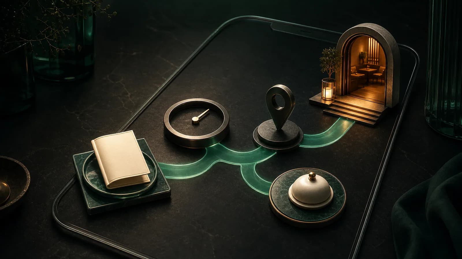
The proposed mobile experience begins with four clear routes: view the current menu, check today's service information, get directions, or contact the restaurant. These actions appear near the top without turning the page into a row of floating buttons.
The menu becomes structured website content, organized by the same sections guests hear from staff. A printable file can remain as a secondary option, but it is not the only source. Prices and availability carry a last-reviewed process behind them, and temporary items are easy for staff to update.
Hours distinguish normal service, kitchen cutoffs where relevant, and one-off changes. The page uses plain language instead of showing a green "open" state that may not understand private events, capacity, or last orders.
Implementation approach
- Interview front-of-house staff about the questions they answer most often.
- Create one structured menu source with item name, description, price, availability, and responsibly reviewed dietary notes.
- Place current hours, address, directions, and contact actions in a compact mobile hierarchy.
- Use the popup and announcement tool as a restrained service-update bar for genuine closures or changes, with an explicit expiry.
- Add a WhatsApp contact option only if the team can monitor it, and prefill the type of enquiry without collecting unnecessary details.
- Keep reservation language accurate: a request is not a confirmed table until the booking system or staff says so.
- Test on small screens, slow mobile connections, keyboard navigation, and screen readers.
The design should reserve space for any announcement so the page does not jump after load. Large imagery can be responsive and lazy-loaded below essential practical content.
Measurement plan
The restaurant would monitor task-oriented signals:
- Menu opens and movement between menu sections.
- Today's-hours, directions, phone, reservation, and message actions.
- Searches or repeated visits to unavailable menu information.
- Reservation-request completion and validation errors.
- Service enquiries that indicate an important detail was hard to find.
- Update-bar views, dismissals, and expired notices.
- Mobile performance and interaction problems on common landing pages.
The team should review these signals alongside staff observations. A directions tap does not confirm a visit, and a menu view is not a booking. The aim is to identify friction, not turn every interaction into an inflated result claim.
Guardrails
Menu descriptions, prices, and hours need an owner and a simple correction path. Allergy and dietary wording must follow the restaurant's actual kitchen practices and applicable guidance; a website label should not promise that cross-contact is impossible. Visitors should be encouraged to speak with staff where appropriate.
Contact channels need visible response expectations. Do not request payment card data or sensitive personal information in a general message. Preserve an accessible alternative when a map, booking provider, or messaging service fails.
What success would mean
Success would be a guest who can answer the practical questions for a visit in a few clear steps, and a restaurant team that can update key information without editing several conflicting pages. Staff would receive better-context enquiries while retaining the human conversation hospitality requires.
Restaurants can prototype focused contact and announcement experiences with Jsyxi tools. For a custom menu, booking integration, or mobile performance review, explore services or contact the team.
Could this approach fit your business?
Start free, or book a consultation to turn the most relevant ideas into a practical plan.